

Personal projects to recover old dusty classics.
First up, Moby Dick has been illustrated many times. I decided to use an artistic approach of creating thick paint strokes, leaving negative space to create the great white whale. The title font has been hand drawn in one continuous line to emulate the sea waves.
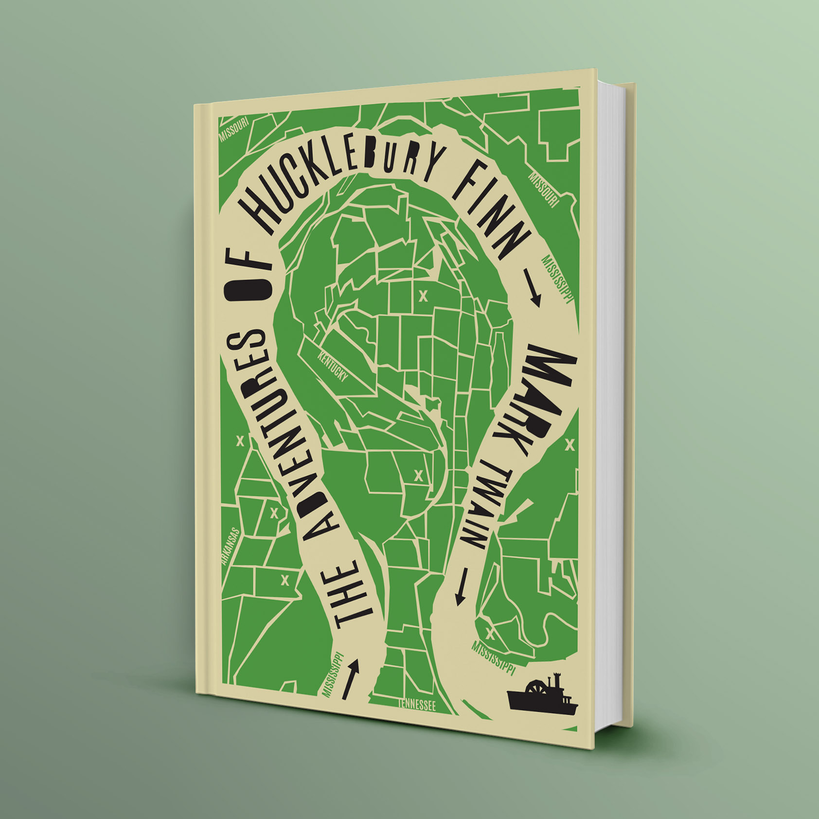
The Adventures Of Hucklebury Finn following his travels down the Mississippi River. I decided to illustrate a modernised map of his journey through Kentucky, Missouri and Tennessee. The river has a lovely flow from left to right for showcasing the typography.
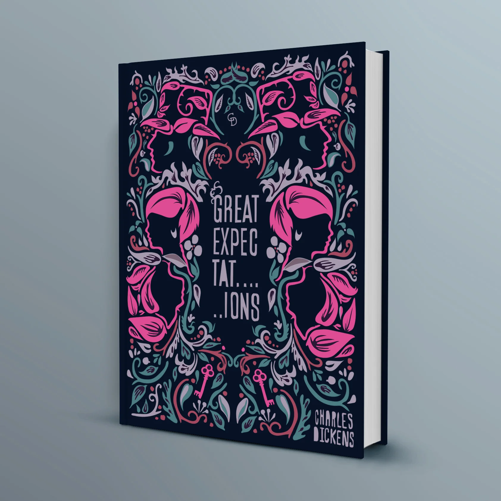
A revamp of Great Expectations by Charles Dickens using a hand drawn William Morris inspired pattern. The Characters and the mansion key are highlighted in a vibrant hot pink to modernise the design. Title and author are also hand drawn to maintain the illustrative approach.

Another dusty book project, The Invisible Man.
I’ve used the negative space to create the ‘invisible man’ and the typography to frame that space and fill the cover itself. Foot print trails are symbolic of someone invisible so this is used to draw the neckline.
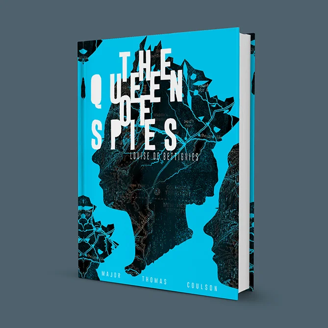
A recover of The Queen of Spies - the biography of Louise Marie Jeanne. Louise ran the French spy network in WW1, so I have used a map of France to distress the queens head. I have chosen an electric blue colour with reduced leading through the type to allow the reader to literally ‘decode’ the title.

Another dusty book project where I have restyled an old classic, The Complete Illustrated Short Stories of Sherlock Holmes with a screen print effect. A modern typographic approach where the letter ‘o’ of the word ‘complete’ is creating the shape of Sherlocks pipe.